
Fourth in an occasional series drawing on Tony Ladson’s blog — his explanation and the underlying argument are his (and, one step further back, Ed Hawkins’); I’m providing a Python-side follow-up for readers who’d rather see it measured than just told. Source: Rainbow colour scales in hydrologic maps and charts, drawing on Ed Hawkins’ Scrap rainbow colour scales (Nature, 2015).
“Don’t use jet/rainbow colourmaps” is good advice that usually arrives as a style preference. It isn’t one — it’s a measurable property of the colourmap, independent of whatever data you plot with it.
Measuring it
A well-behaved colourmap should have perceptual lightness change monotonically across its range — consistently light-to-dark or dark-to-light. If lightness goes up, then down, then up again as the underlying value increases smoothly, the eye reads false boundaries at each light/dark transition, whether or not the data has a boundary there.
import numpy as np
import matplotlib.pyplot as plt
from colorspacious import cspace_convert  # pip install colorspacious

def colormap_lightness(cmap_name, n=256):
    cmap = plt.get_cmap(cmap_name, n)
    rgb = cmap(np.linspace(0, 1, n))[:, :3]
    lab = cspace_convert(rgb, 'sRGB1', 'CIELab')
    return lab[:, 0]  # L* channel

for name in ['jet', 'viridis', 'cividis']:
    L = colormap_lightness(name)
    direction_changes = np.sum(np.diff(np.sign(np.diff(L))) != 0)
    print(f'{name:10s} direction changes = {direction_changes}')
jet        direction changes = 5
viridis    direction changes = 0
cividis    direction changes = 0
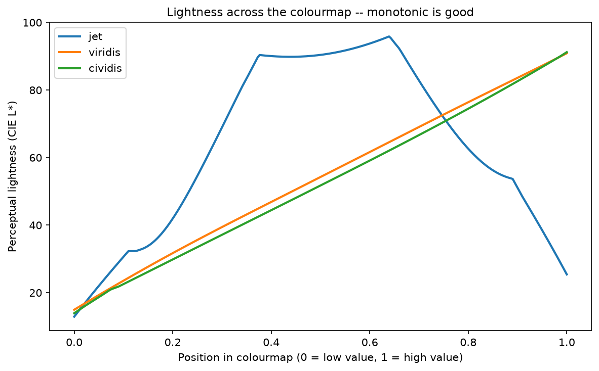
This is the same library (colorspacious) used to justify viridis’s design in the first place — not a new claim, just independently re-measured.
What that looks like on real-shaped data
The clearest version of this doesn’t need real data at all — a single smooth Gaussian peak, with zero genuine edges anywhere, makes the point on its own:
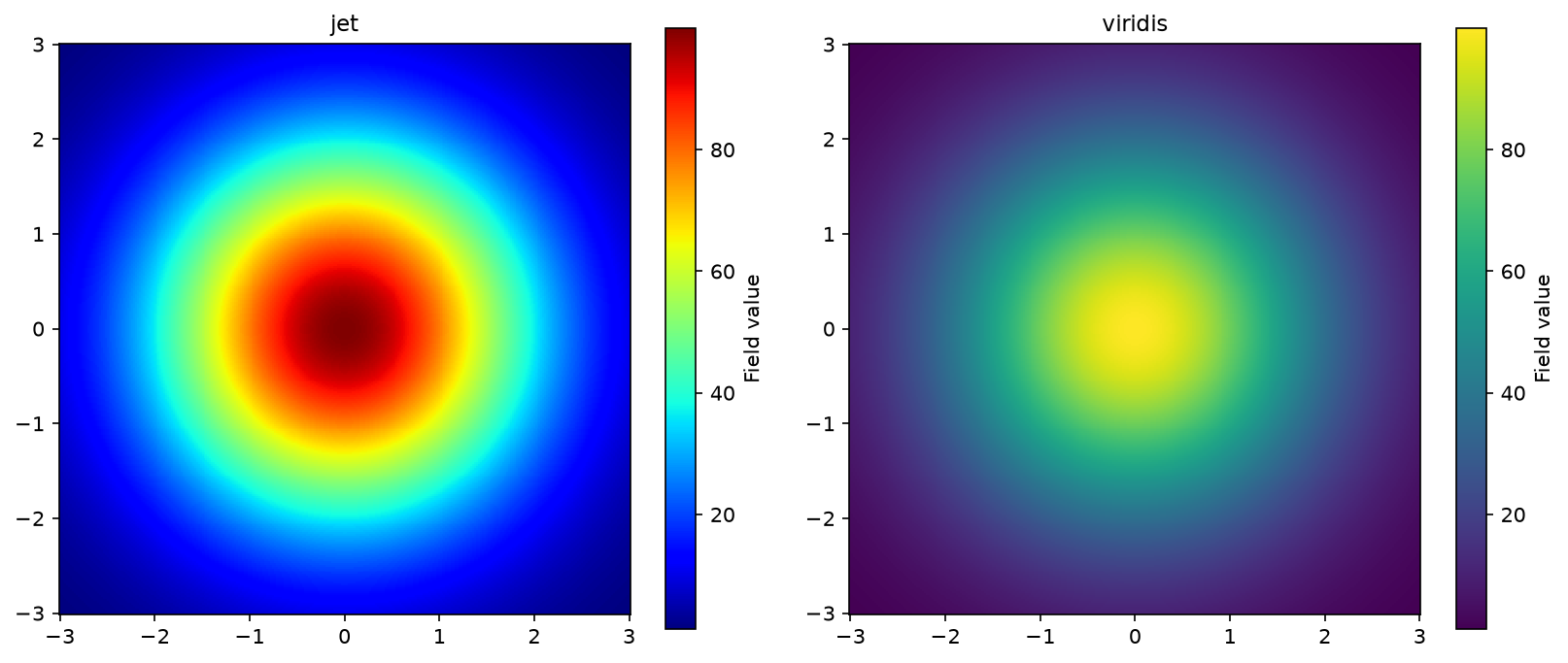
Nothing about the underlying field changed between those two panels. Only the colourmap did.
The other half of the lesson
Ed Hawkins’ warming stripes make a different, complementary point that’s worth keeping separate from “pick a better colourmap”: sometimes the right fix isn’t a better colourmap at all, it’s asking whether the reader needs axes, gridlines and a legend, or whether colour alone — no other chart furniture — communicates the pattern more directly. That’s a genuinely different design decision, and I’d rather point you to Hawkins’ own explanation and the real visualisation than build an approximation of it here with data I couldn’t verify.
Companion notebook: notebooks/11_rainbow_colour_scales/
References:
- Ladson, A.R. (2016). Rainbow colour scales in hydrologic maps and charts.
- Hawkins, E. (2015). Scrap rainbow colour scales. Nature 519, 291.
- Hawkins, E. #ShowYourStripes.