
Weather balloons (radiosondes) go up from Bureau of Meteorology stations twice a day, measuring temperature, humidity, pressure and wind through the full depth of the atmosphere. The standard way to plot that vertical profile is a Skew-T Log-P diagram — a chart most hydrologists and flood engineers have seen in a BOM severe weather discussion at some point without necessarily having been taught to read. It’s worth twenty minutes, because it’s the diagram underpinning thunderstorm and heavy rainfall outlooks, and precipitable water — a number that comes straight off it — is a genuinely useful sanity check on design rainfall intensities.
Why “skewed”?
A plain temperature-vs-height plot has a problem: on a typical profile, the isotherms (constant temperature) and the dry adiabats (the rate a rising, unsaturated parcel of air cools) are nearly parallel, which makes it hard to read stability off the chart at a glance. Skewing the temperature axis at 45° to the pressure axis fixes that — it opens up the angle between isotherms and adiabats, so the shape that indicates instability (temperature and dew point profiles bulging apart, adiabats crossing the sounding at a shallow angle) becomes visually obvious rather than something you have to calculate to notice. Pressure decreases logarithmically up the y-axis, matching the actual (non-linear) decrease of pressure with height.
What’s actually on the chart
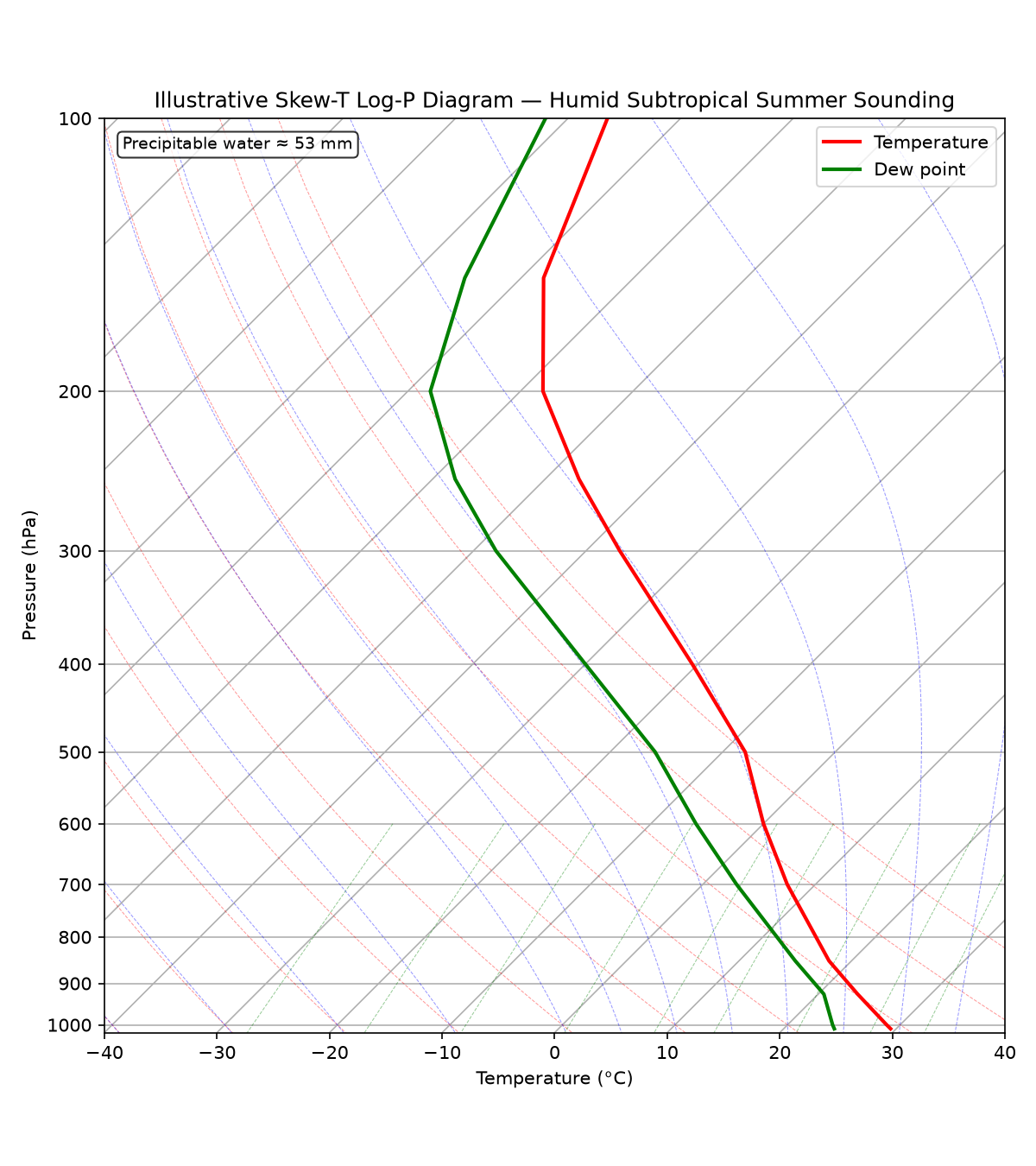
- Temperature profile (usually red) — the environmental temperature at each pressure level.
- Dew point profile (usually green) — how close the air is to saturation at each level. Where temperature and dew point are close together, the air is humid; where they’re far apart, it’s dry.
- Dry adiabats — the path an unsaturated rising air parcel’s temperature follows (cooling at ~9.8°C/km).
- Moist adiabats — the path a saturated rising parcel follows (cooling more slowly, since condensation releases latent heat).
- Mixing ratio lines — lines of constant water vapour content, used to read saturation mixing ratios directly off the dew point curve.
A worked illustrative example
The figure below is a synthetic but physically realistic sounding for a humid subtropical summer profile — not a specific historical observation, built to illustrate the reading, not to reproduce one exact day:
import numpy as np
from metpy.plots import SkewT
from metpy.units import units
import metpy.calc as mpcalc
import matplotlib.pyplot as plt

p = np.array([1010, 1000, 925, 850, 700, 600, 500, 400, 300, 250, 200, 150, 100]) * units.hPa
T = np.array([29.5, 28.8, 23.5, 18.0, 7.5, 0.0, -8.0, -20.5, -37.0, -47.0, -58.0, -68.0, -76.5]) * units.degC
Td = np.array([24.5, 24.0, 20.5, 15.0, 3.0, -6.0, -16.0, -30.0, -48.0, -58.0, -68.0, -75.0, -82.0]) * units.degC

fig = plt.figure(figsize=(8, 9))
skew = SkewT(fig, rotation=45)
skew.plot(p, T, 'r', lw=2, label='Temperature')
skew.plot(p, Td, 'g', lw=2, label='Dew point')
skew.plot_dry_adiabats(lw=0.5, alpha=0.4)
skew.plot_moist_adiabats(lw=0.5, alpha=0.4)
skew.plot_mixing_lines(lw=0.5, alpha=0.4)

pw = mpcalc.precipitable_water(p, Td)
print(f"Precipitable water: {pw.to('mm').magnitude:.0f} mm")
For this profile, precipitable water comes out around 53 mm.
Why precipitable water is the number worth extracting
Precipitable water — the total column of water vapour, expressed as the depth it would occupy if entirely condensed and fallen as rain — is a genuine upper bound in a physical sense: it isn’t the amount of rain a storm will produce (real storms process far more water than the column initially holds, since moisture continually flows in from outside the column as a storm develops), but it’s a quick, physically grounded gut-check on whether a claimed design rainfall depth is at least in the right neighbourhood for the atmospheric moisture actually available on the day, and it’s one of the standard diagnostic inputs BOM meteorologists reference in severe thunderstorm and heavy rainfall outlooks. If precipitable water is trending well above normal, that’s a fast, independent, physically-motivated read on why an outlook is elevated — worth having in your own toolkit as a check on rainfall analysis, not just as background reading for BOM’s own severe weather discussions.
Requirements
pip install metpy numpy matplotlib
MetPy is a well-maintained, purpose-built atmospheric science plotting library — it handles the coordinate transforms and adiabat/mixing-line overlays correctly, which is fiddly enough to get right by hand that it’s not worth reimplementing.