
Joy Division’s 1979 album Unknown Pleasures features a cover designed by Peter Saville, based on a Cambridge Encyclopedia of Astronomy illustration of radio emissions from pulsar CP 1919. Stacked ridgeline plots — each line a successive time period, offset vertically, white on black — turn scientific data into something striking.
The technique has been revived as the “joy plot” (named for the band). It works because it’s not just aesthetic: it reveals the distribution of values across time in a way that standard time series or box plots don’t.
I applied it to 136 years of weekly rainfall at Aldersley, Brisbane.
The Visualisation
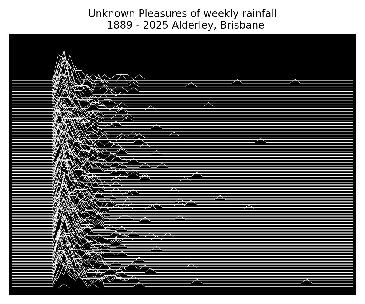
Each ridgeline is one year of weekly rainfall totals. Years are stacked chronologically from bottom to top. The peaks of each line are weeks with high rainfall; the flat sections are dry runs. The stacking reveals both the seasonal structure (the repeated shape of the wet season, week by week) and year-to-year variability.
Why Weekly?
Daily rainfall is too granular — the plot becomes noise. Annual totals lose all within-year structure. Weekly aggregates sit in the sweet spot: they smooth out isolated convective events while preserving the seasonal envelope.
For an Australian subtropical station, the weekly resolution clearly shows:
- The dry season trough (May–September): consistently flat ridgelines
- The wet season peaks (December–March): tall, variable ridgelines that differ substantially between years
- Major wet years stand out as ridgelines that rise well above their neighbours — visually identifiable without needing to look up the year
The Station: Aldersley
Aldersley is a gauge in Brisbane’s inner northwest, with a long, largely continuous record through the SILO Patched Point Dataset. Like all SILO records, gap-filling uses spatial interpolation from surrounding gauges, so the century-scale record is continuous rather than fragmentary.
136 years of data from a single location is a substantial asset for understanding local hydrology. Most of it sits unexamined in government databases.
The Point
Data visualisation in hydrology is still dominated by time series line plots and bar charts — formats that work but don’t surprise. The joy plot format communicates something that a standard annual rainfall chart doesn’t: the texture of the rainfall record, the year-to-year variability, the structure of a century of weather at a single place.
It’s the kind of plot that makes someone stop and look. That’s worth something.
Data: QLD Government SILO Patched Point Dataset. Station: Aldersley, Brisbane, 1889–2025. Originally shared on LinkedIn.