
Third in an occasional series porting specific methods from Tony Ladson’s blog to Python — his explanation and the underlying method are his; I’m just providing a translation for readers who know Python better than R. Sources: Visualising Hydrologic Data and the concrete worked example, Better line graphs for hydrologic data, R in his gist.
Six creeks, six unrelated peak-flow-vs-duration lines on one chart. Ladson’s example (invented creek names, made-up numbers — a teaching example, not a real gauge record) makes two points at once.
Point one: sequential palettes are for ordered data
blues = plt.cm.Blues(np.linspace(0.35, 0.95, len(creeks)))  # mimics brewer.pal(8,'Blues')[3:8]

fig, ax = plt.subplots(figsize=(7, 5))
for (name, flows), color in zip(creeks.items(), blues):
    ax.plot(durations, flows, marker='o', color=color, label=name)
ax.legend(fontsize=8)
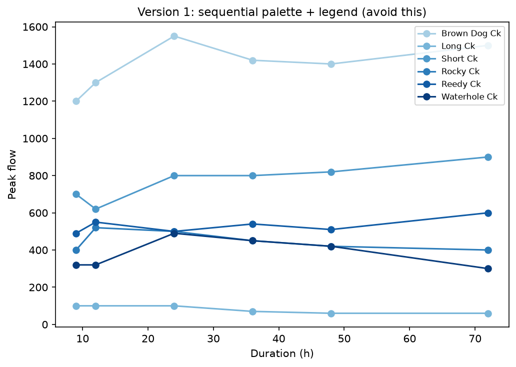
A sequential palette encodes order — light to dark implies low to high. These six creeks have no natural order; picking a sequential palette to tell them apart imports a ranking that isn’t there, and (worse, practically) the mid-range blues used for the middle of the palette are genuinely hard to tell apart at a glance.
Point two: a legend makes the reader do the work
The fix is two changes at once: a qualitative palette built for categorical data (Dark2 — matplotlib ships the identical ColorBrewer palette Ladson uses in R), and labelling each line directly instead of routing identification through a legend the reader has to look back and forth to.
dark2 = plt.cm.Dark2(np.linspace(0, 1, len(creeks)))

fig, ax = plt.subplots(figsize=(8, 5.5))
for (name, flows), color in zip(creeks.items(), dark2):
    ax.plot(durations, flows, marker='o', color=color)
    ax.annotate(name, xy=(durations[0], flows[0]), xytext=(-8, 0),
                textcoords='offset points', ha='right', va='center', fontsize=8, color=color)
    ax.annotate(name, xy=(durations[-1], flows[-1]), xytext=(8, 0),
                textcoords='offset points', ha='left', va='center', fontsize=8, color=color)
for spine in ['top', 'right']:
    ax.spines[spine].set_visible(False)
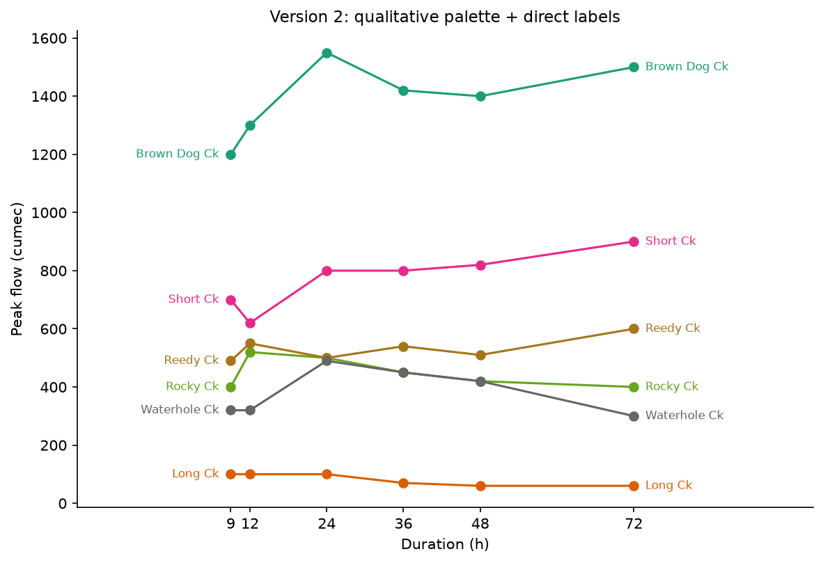
Not perfect — where lines start close together (Reedy, Rocky and Waterhole Creeks all begin within about 150 units of each other), the left-hand labels still sit tight against one another. That’s an honest limitation of direct labelling when the data itself is genuinely bunched, not something the technique fixes for free — it shows up in Ladson’s original R version too, for the same reason.
Companion notebook: notebooks/10_better_line_graphs/
Source: Ladson, A.R. (2018). Better line graphs for hydrologic data; companion page Visualising Hydrologic Data. R source: gist.github.com/TonyLadson/732e3dbcb8aeaf76fd25c04f6ff246b7.